Illustrate the empirical distribution of states against time in intermittently-observed multistate data
Source:R/msmhist.R
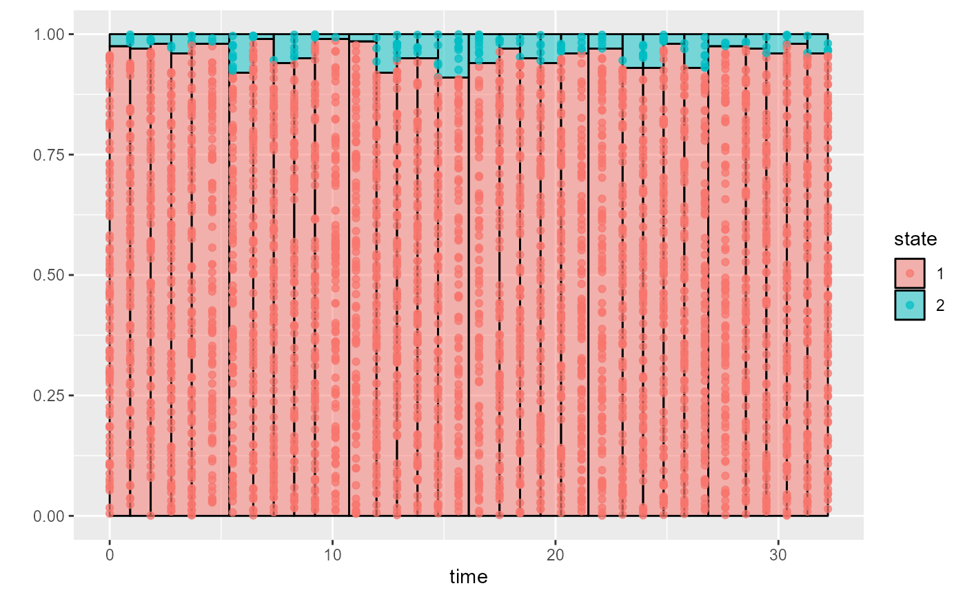
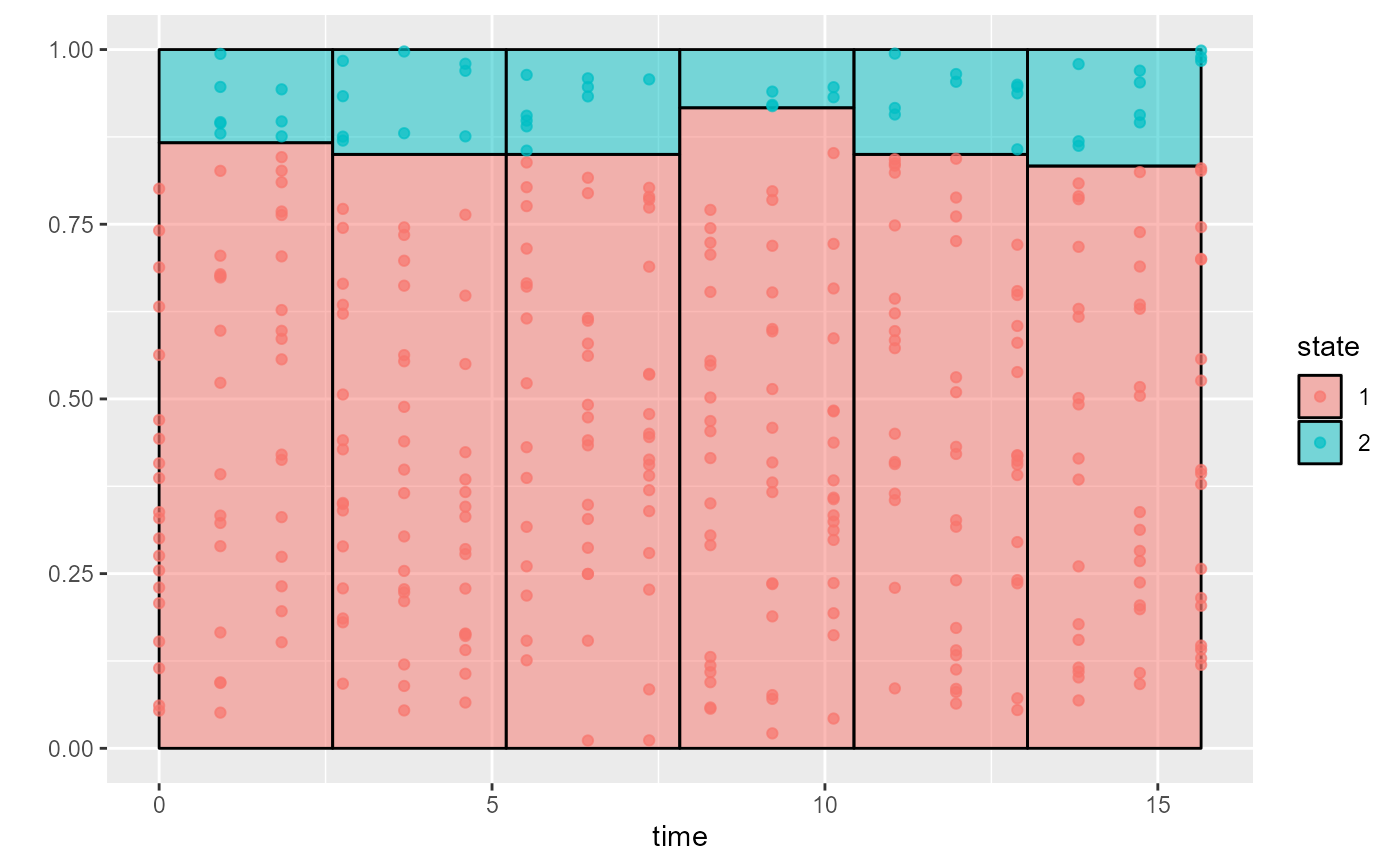
msmhist.RdThis works similarly to a histogram. The state observations are binned into time intervals with roughly equal numbers of observations. Within each bin, the probability \(p(s)\) that an observation comes from each state \(s\) is estimated.
Usage
msmhist(
  data,
  state = "state",
  time = "time",
  subject = "subject",
  nbins,
  absorbing = NULL,
  censtimes = NULL,
  stacked = TRUE
)
Arguments
- data
Data frame giving the observed data.
- state
Character string naming the observed state variable in the data. This variable must either be an integer in 1,2,...,K, where K is the number of states, or a factor with these integers as level labels. If omitted, this is assumed to be
"state".- time
Character string naming the observation time variable in the data. If omitted, this is assumed to be
"time".- subject
Character string naming the individual ID variable in the data. If omitted, this is assumed to be
"subject".- nbins
Number of time intervals to bin the state observations into. The underlying distribution of states illustrated by the plot will be assumed constant within each interval.
- absorbing
Indices of any absorbing states. Individuals are assumed to stay in their absorbing state, and contribute one observation to each bin after their absorption time. By default, no states are assumed to be absorbing.
- censtimes
Vector of maximum intended follow-up times for the people in the data who entered absorbing states. This supposes that had the person not entered the absorbing state, they would not have been observed after this time.
- stacked
If
TRUEdo a bar chart with the probabilities for different states stacked on top of each other, so the y-axis spans 0 to 1 exactly. This is more compact.If
FALSE, plot one panel per state, as is done inprevalence.msm. This is more convenient for constructing a check of the model fit.
Details
If each subject has at most one observation in a bin, then \(p(s)\) is estimated as the proportion of observations in the bin that are of that state.
More generally, if an individual has more than one observation in the bin, \(p(s)\) is estimated as follows. For each observed individual \(i\) and each state \(s\), we define a variable \(p(i,s)\) equal to the proportion of individual \(i\)'s observations that are of state \(s\). For example, in a three-state model, where a person has two observations in a bin, and these are states 2 and 3, then \(p(i,s) = 0, 0.5, 0.5\) for states 1, 2 and 3 respectively. The bin-specific estimate of \(p(s)\) is then the average of \(p(i,s)\) over individuals \(s\) who have at least one observation in that bin.
The results are visualised as a stacked bar plot. The individual observations of states are represented as points placed at random y positions within each state-specific bar.
This is intended as an alternative to the "observed prevalences"
plot in the function prevalence.msm from the msm package,
with a clearer connection to the data. It can be overlaid
with predictions of transition probabilities from a msmbayes
or msm model, to check the fit of the model.
The method used by "observed prevalences" plots places a strong assumption on the (unobserved) individual data, that individuals stay in the same state between observations, or transition at the midpoint between observations.
msmhist places no assumption on the individual data. Instead
the assumption is placed on the distribution underlying the data.
In a similar fashion to a histogram, it assumes that the
distribution of states is the same at all times within each
time interval bin.
See also
msmhist_bardata to extract the numbers
behind this plot so the plot can be customised by hand.

